This section will introduce you to applications that allow you to mimic SAV functionality from the command line.
You can download the demo dataset used in this example here: MiSeqDemo.zip
The following plot commands all take, as input, a run folder and write a plot, in the GNUPlot script format, to the console (stdout). Anything written to the console in this manner can be redirected to a file or another program such as GNUPlot. In addition, you can copy this output into Excel and plot it there.
Each plot command has an additional set of options that allow the user to choose a specific metric to plot or how to filter the data. For example, the user can choose to only plot data from lane 1 by specifiying the option --filter-by-lane=1. A full list of options for each program can be obtained with the --help flag.
SAV Analysis Tab
Flowcell Heatmap
Starting on the left, the SAV Analysis page has a flowcell heat map. This heatmap can show a metric, such as Intensity, for each tile in the flowcell. The InterOp apps include a plot_flowcell command that can be used to generate this heatmap as follows:
The following is an example plot generated by the sample dataset listed above using the default command. It shows the Intensity of channel A for each tile on a MiSeq flowcell.

Alternatively, the user can have the data printed to the console as follows:
Or, can redirect the plot data to a file just so:
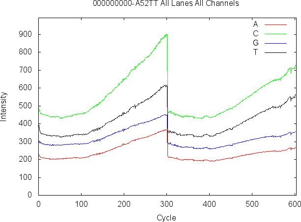
Plot By Cycle
The plot at the top center of the SAV Analysis tab displays how a single metric changes from cycle to cycle.
The following command may be used to generate the example plot shown below.
Here, the intensity of each average channel is plotted with respect to sequencing cycle.
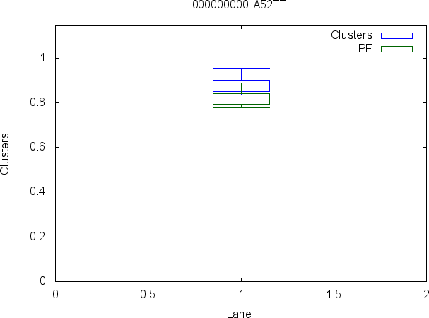
Plot By Lane
The plot at the bottom center position of the SAV Analysis tab displays an average over all tiles for each lane.
The following command may be used to generate the example plot shown below.
Here, the cluster count passed filter (PF) and the cluster count are plotted with respect to each lane in the flowcell.
Q-Score Histogram
The plot at the top left position of the SAV Analysis tab displays a histogram of the Q-scores over all cycles of the run.
The following command may be used to generate the example plot shown below.

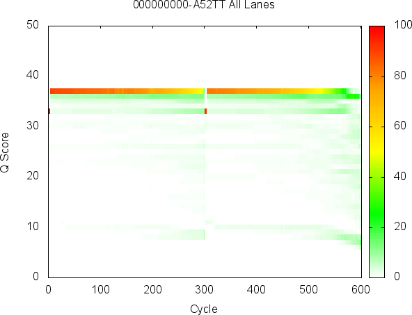
Q-Score Heatmap
The plot at the bottom left position of the SAV Analysis tab displays Q-score heatmap, which compares Q-score on the Y-axis to the cycle on the X-axis.
The following command may be used to generate the example plot shown below.